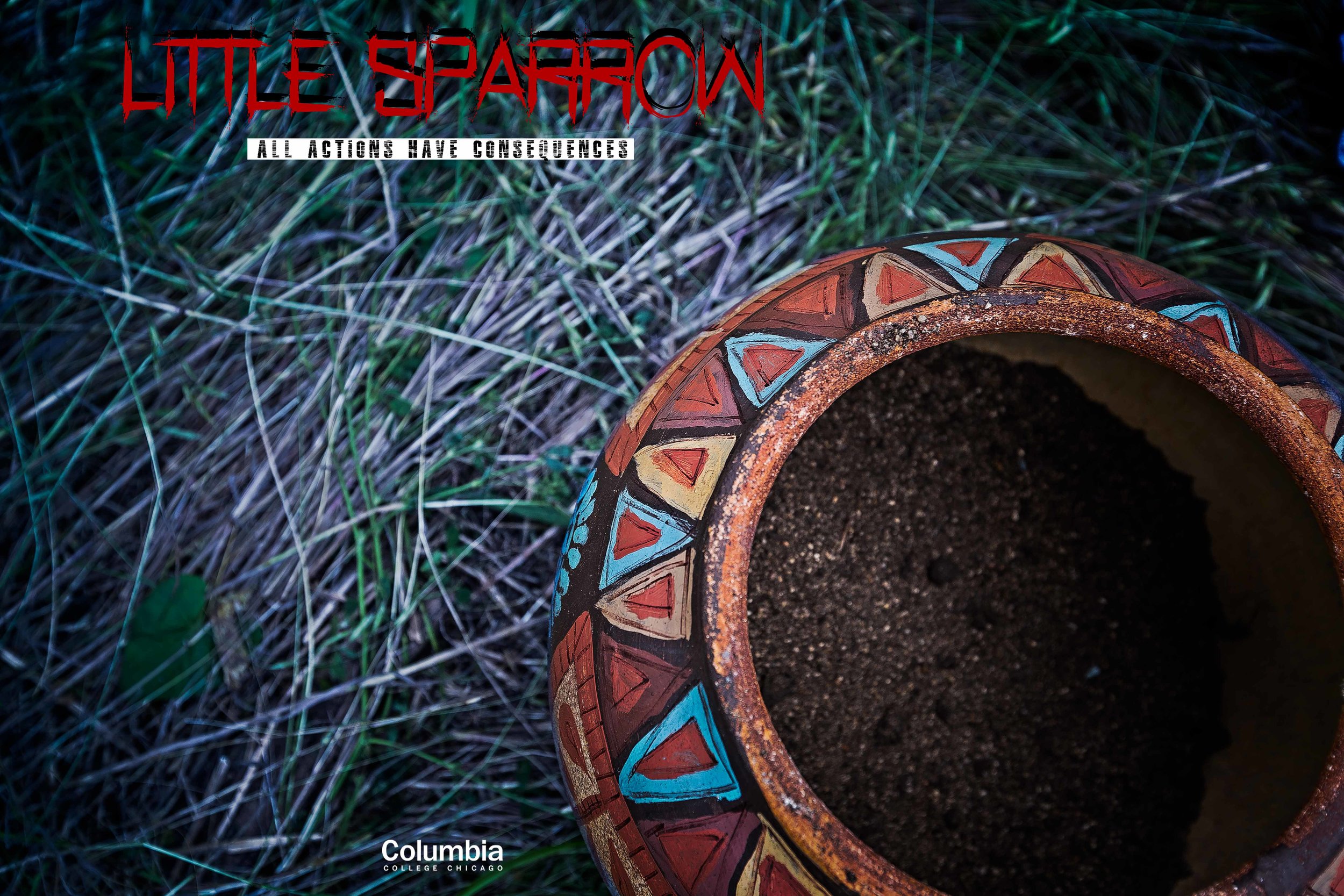
*Note from the author of 'Mentha Rapture' This font is made by Bumbayo Font Fabrik.
Use it for all your creations!
Version 2 © 2017.
Under Licensed by Creative Commons CC-BY-SA 3.0)
LOGO TYPE FONT: 'Real Horror' Author: Chris Vile
SLUG/SLOGAN FONT: 'Mentha Rapture' Author: Bumbayo Font Fabrik
COPYRIGHT NOTICE
The following work, regarding the use and design of the fonts, was done strictly in an educational environment for the Practicum Program in Columbia College Chicago and is not intended to be for profit or commercial use. The work herein in is meant to help promote the skills and craft of those who participated to bring this film together.
FILM SET - JACKSON PARK
ON LOCATION
RE-SHOOTS & PICK-UP SHOTS
The Film "LITTLE SPARROW" is a horror thriller directed by Ali Mango and written by both Tiana Luccacioni and Ali Mango. The re-shoots for the film took place when the weather was quite favorable during the spring. Unfortunately this was a nightmare for continuity in post-production as the initial principal photography took place in the winter of 2017.
The film shot on location in Jefferson Park, down in the south side of Chicago. Getting there was up to me since my call time wasn’t until noon. Even so, this gave me plenty of time to go around the location and capture some high resolution B-roll Footage to match the shots they were getting.
It was an intense shoot because we were shooting during times of high shrubbery in the late spring early fall of 2018. The issue with that was that this posed many obstacles for the drone aerially. One idea I proposed was that we use the drone as a stedicam in order to get some shots in tighter areas, since the DJI Phantom PRO 4K has a very beautiful 24 mm lenses built in.
THE TALENT
Name: Ansel Carpenter
Character: ‘DUNA’
Name: Michael Abraham
Character: ‘KARPRE’
Name: Gabrieille Perrea
Character: ‘BROGA’
DRONE CINEMATOGRAPHY
Flying through the forest definitely required a certain kind of discipline. It was very freeing to fly above the water, away from the forest. The open spaces allowed for the best B-roll footage with the allotted time on location.
MARKETING MATERIALS
TRAILER & MARKETING SPOTS
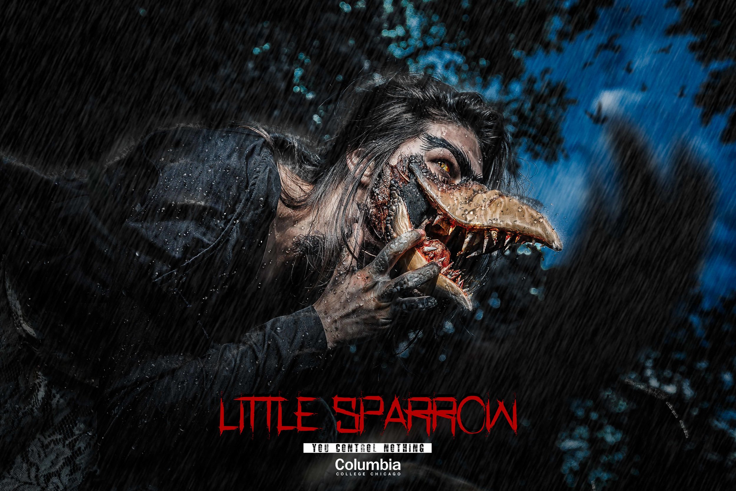
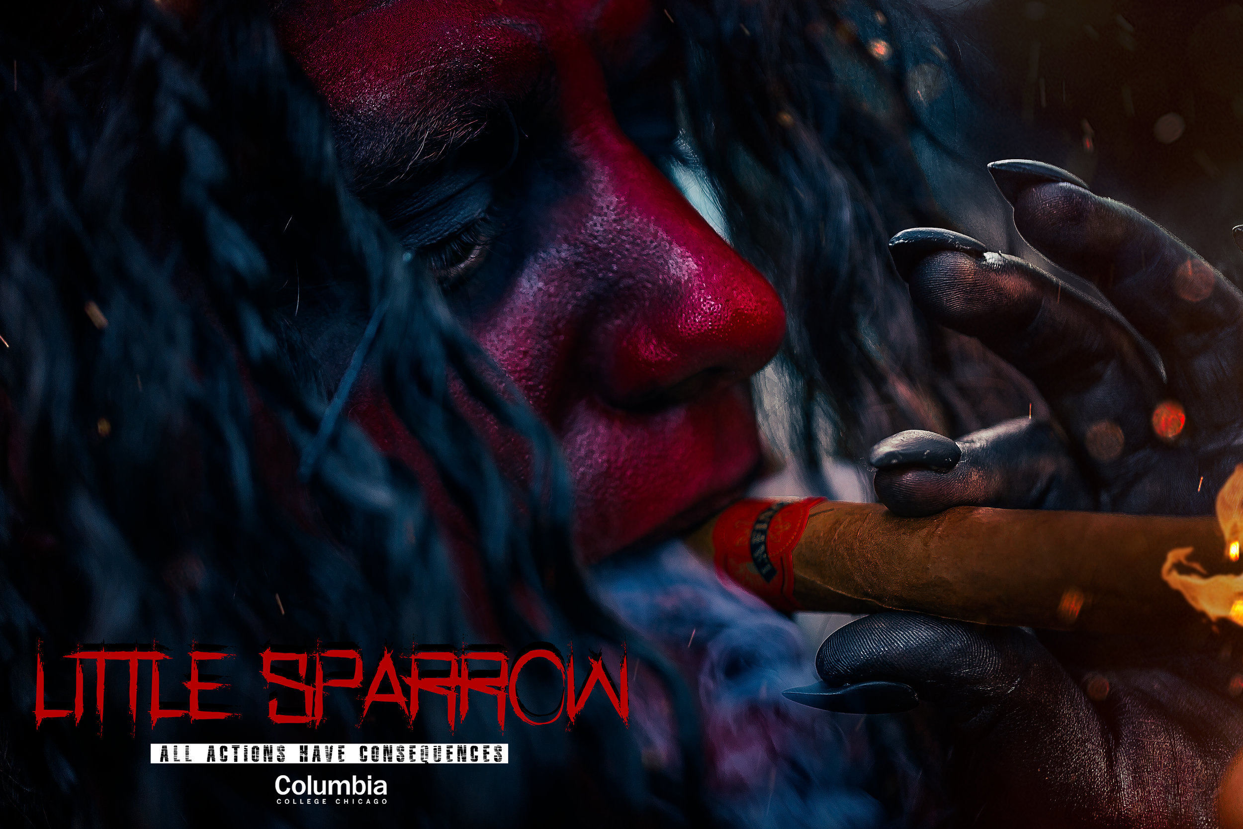
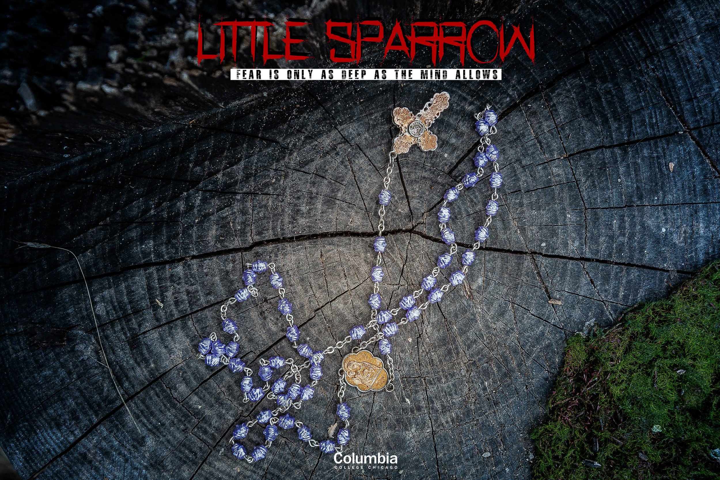
The color of the film was decided early on by Ali Mango, Tiana Luccacioni and Hex Yang for the principal photography. After the set wrapped and the first phase of post production began with Ali Mango and editor Mia Puluso; I was given some unit stills from their first set photographer and was asked to create a mock up one sheet.
The marketing content was to embody the same color elements that was decided prior, while essentially becoming a launching point for the brand of the film. It was to be the foundation to which the rest of the key art and trailers were drafted from. The colorists used these images as inspiration in order to make sure the colors of the brand stay true to the film.
TYPOGRAPHY & MOTION GRAPHICS
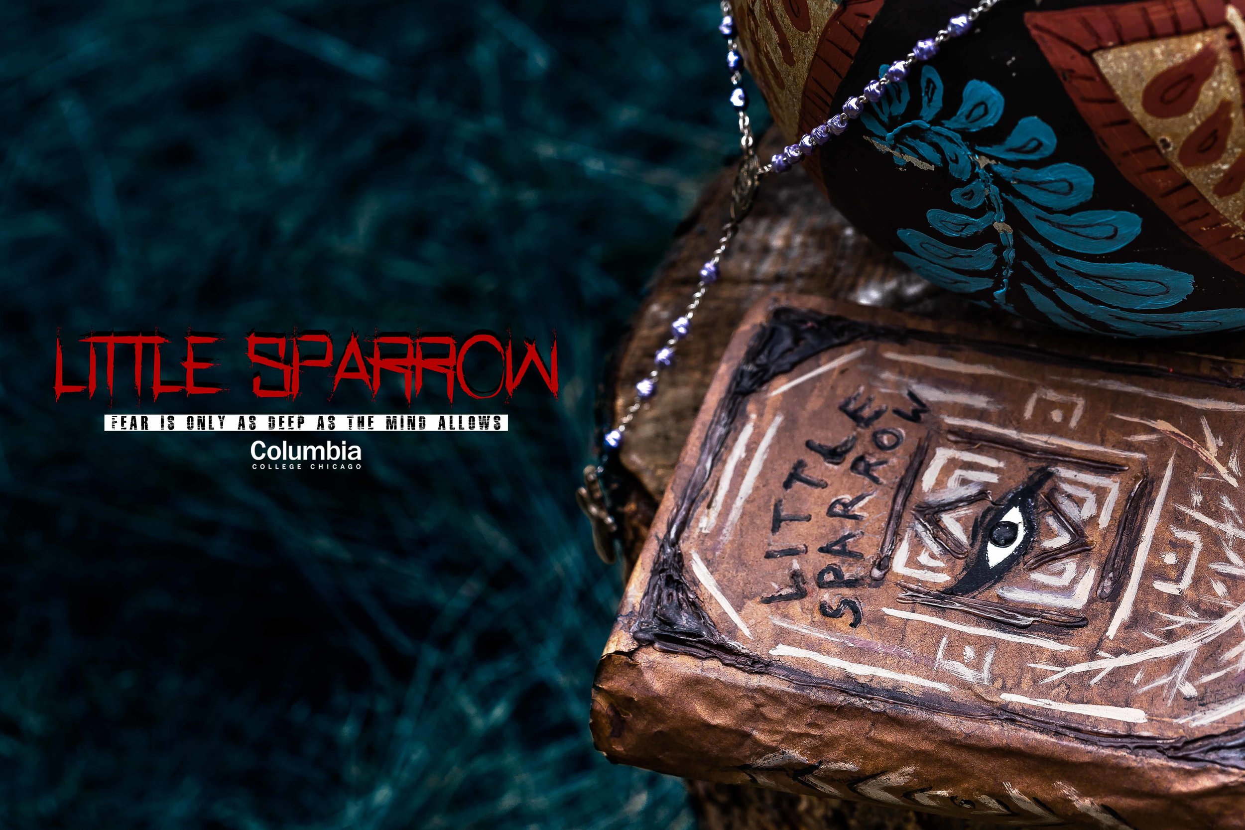
The typography itself was inspired by the plot of the film. I, fortunately, was allowed access to the prop book from the actual film and decided to photograph it using a Canon Rebel t3i, and a basic soft-box kit.
Once the film had been completed and approved by the director, producers, and staff of Columbia College I received a cut of the film and began cutting the trailers. I was aware of the role that the key art design had played so I edited while keeping the film brand on my mind. I then borrowed some ink from one of the set decorators, and purchased different types and styles of paper. The paper ranged from thin and colorful industrial to thick off-white organic A4 US size paper.
A special ratio of ink to water was needed in order to capture the motion required. Then using a small vaporizer juice dropper to absorb the ink, drop it down on the paper randomly.
While this may look like some abstract fine art, there was more to to be done in the post production phase. I was going to chroma key out the white of the paper and keep the ink from both the live action assets and the high resolution photographs. Taking the photographs into Adobe After Effects allowed me to manipulate the media so I could animate the assets I needed in order to create the title cards. The incorporation of graphic design elements was integral to the process. I recorded the actual droplets as a video then also took the a photograph of the whole paper with the ink stains.
POST PRODUCTION
Using Adobe Photoshop to set a base composition for the ink stains, fonts, and background textures; then imported the composite into Adobe After Effects using dynamic link and continued by adding the live action elements while masking in and out the necessary aspects needed for the final piece.
Adobe Photoshop User Interface
Adobe After Effects User Interface
TRAILERS & TEASERS THE EDITS
I became very familiar with the footage as I began to cut the selects together. I chose to use Adobe Premiere Pro to edit these trailers because there was an update to the project panel that allows the editors to create, basically, a storyboard with the available clips as well as label them and change their color and size. When satisfied, it was simply a drag and drop motion to get it to the timeline, thus revealing an already laid out sequence.
The director had wanted a child like hymn to play in one of the trailer as the juxtaposition with the eerie images cause cognitive dissonance within the psyche leading to an uncomfortable sensation within the body, just beneath the level of consciousness.
KEY ART & ONE SHEETS
CONCEPTS
The ensemble image started out as a series of separate unit stills from the set that I had intended to retouch. These initial unit stills only included the talent and a few crew members scattered around the image, which I then removed in Adobe Photoshop. The director later came back to me with a select few stills from the set photos I had submitted, and asked if we could merge four or five of them into the original wide shot of the environment. I instantly loved the idea and was on board for it; yet it was definitely one of the harder pieces of key art. Technically, the original composite image came out to be just under 100 megapixel, coming in at about 7.7 GB!
